American Airlines
AAdvantage is the frequent flyer awards program from American Airlines. This media kit was targeted towards ad agencies, marketing consultants and major corporations interested in advertising in the monthly statements and various inserts tying in services (car rentals, hotels, etc.) with the AAdvantage program. The kit was designed as a step book containing program facts (including demographics), a summary of AAdvantage promotional material and member mailings, specifications for advertising and rate cards.
inside spread
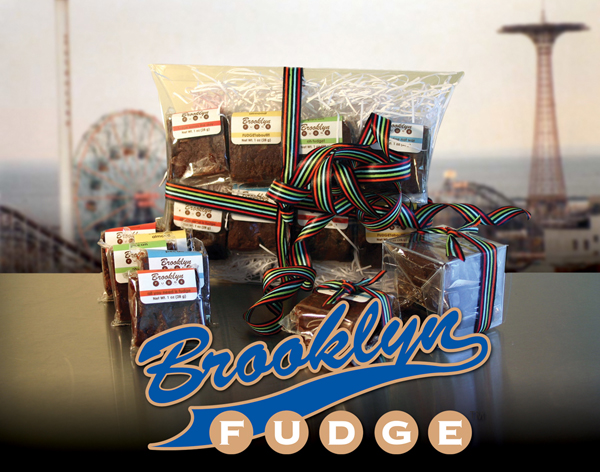
Brooklyn Fudge
In promoting Brooklyn Fudge, you couldn’t ask for a better starting off point than the home of Brooklyn Fudge itself… Brooklyn! The graphics were designed to “tie-in” with BF’s promotional campaigns by utilizing the “feel” and imagery of Brooklyn. The logo resembles the lettering of the Brooklyn Dodgers’ home game jerseys. This would be a nostalgic approach; a reminder of the historic, mythic Brooklyn of days gone by as well as identifying with the Brooklyn of today... once the home of the Dodgers, and now the home of another, new homegrown product.
MCM and Wallach Sons
These projects are my few forays in the field of fashion merchandising. The Patricia Collection was designed and developed by Patty Cromer, the daughter of Michael Cromer, MCM's founder. This collection of purses, handbags and clutches is aimed at a somewhat younger audience than MCM's usual consumer base of older, well-to-do consumers... like their parents. Wallach Sons of Manhasset is a jewelry store that also features originally designed pieces. In the Moonshower print ad, which I designed and wrote, I felt this particular piece just lent itself to the theme of the headline. I mean, how many times have guys made this promise to their wives and/or girlfriends? Here, they can finally keep that promise. Even if it means going all the way out to Manhasset to do it.
cover
inside pages
direct mail promo
print advertising
BerDesign
Here are some samples of the various graphics projects I have done in the course of my career. I was able to produce work for a wide variety of clients, including the Federal Government (The Small Business Administration, the Central Asia-American Enterprise Fund), educational organizations (Tisch School of Arts at New York University, a student exchange program sponsored by the UJA) and many commercial accounts. In addition to logo design, many of these projects also included graphic identity programs, signage and stationary materials.
logo design
logo design for a sports bar
logo and stationery set
graphic design for greeting card
logo and stationery set
logo design
Scholastic, Inc.
logo design
Small Business Administration, US Federal government
logo design
New York University
UJA Federation of New York
Data Centrum Communications
As art director at Data Centrum Communications, my primary responsibility was the design of all materials for the Health monitor Network, including their branding program. On the right are samples of the Health monitor newsletters and magazines with their new design, as seen in a house ad I had produced. Each newsletter deals with different health issues for various demographic groups. They, along with the flagship Health monitor magazine (which is also in spanish), are available at doctors' offices and clinics throughout the U.S. With the costs being paid for by advertisers, the publications are free.
various covers for the magazine and newsletters
magazine
newsletter
Spanish edition magazine
graphic identity samples
inside spread
inside spread
specialized publication for young women
specialized publication for health care providers
BerDesign
Pictured here is a sampling of designs and graphics for holiday cards I have produced over the years. Thematically, I try not to confine them to just Christmas; I like to encompass the other holidays of the season. In this, I find I’m able to get more in the way of ideas... and less of a chance to fall back on clichés. The result is can be something funny, like Santa as Groucho (“Sanity Claus”), or playing with the idea of holiday gifts. But then, there are events that can overshadow the holiday season such as 9/11. For my 2001 holiday card, I wanted to express what I felt about that day.
BerDesign
Before going into the graphics profession, I had trained as an illustrator. And though that career path got sidetracked, I have been able to still do an occasional illustration project. Of course, being in graphic design over the years began to have an influence on my illustration style. If anything, it helped to give the work more of an impact in communicating ideas, as effectively as any logo design or page layout.
illustration for a friend's birthday card
City of New York
Daily Deal, a financial newspaper
illustration for a card commemorating a wedding
Jewish National Fund
promotional piece for Pinpoint Graphics
Information Express, Palo Alto, California
illustration for the N.Y. Transit Museum
U.S. Holocaust Museum
Jewish National Fund
The Jewish National Fund is an organization involved in creating and implementing ecological projects throughout Israel. One such project is Operation Negev, an ecological initiative which includes the development of irrigation systems in the Negev desert. This program would help to develop farmland in what was once one of the most barren regions in the Middle East.
cover for a JNF report on Israel's water crisis and proposals to solve the problem
inside spreads
cover and inside spread
award certificate
New York Times
Perhaps one of the more interesting projects I have ever done were the series of promotional pieces I had done for the New York Times. These ran the gamut, including spot ads, full page promotions and marketing materials. One special assignment was the announcement of Anne Rice’s appearance at the 92nd Street Y (sponsored by the Times). I took the opportunity of combining the book jacket for her novel Merrick with the art used for the cover, which was The Snake Charmer by Henri Rousseau. I then took the concept a little further by using the font ATS Sackers Gothic for the sans serif font because of its close similiarity to the Copperplate font used in the cover design.
cover design for a promotional piece
full page newspaper ad for a special advertising section in the Times
spot ads for various special sections in the Times
design for a subway advertising campaign
print ad for the Revlon Run/Walk for Women, sponsored by the Times and the NBC Television Network
ad card for a special ad section in The New York Times Magazine
Ad for “Our Life & Times” lecture series
American Technion Society
The American Technion Society is a fund raising organization based in New York dedicated to raising money for the Israel Institute of Technology, which is also known as the Technion. Along with the many promotional projects I was involved with, I had also designed the logo for ATS to commemorate the 50th anniversary of the founding of Israel (shown right). The gold symbolizes the 50th (golden) anniversary while the blue is symbolic of the Technion. This logo was used for the ATS’ fund-raising efforts, including stationery, greeting cards and promotional material.
logo, greeting card and stationery set
note card design for fundraising campaign
poster design
greeting card designs for fundraising campaigns
promotional direct mail piece
Various clients
This section includes a few one shot projects I had developed. The most recent one is the signage I had designed for Bitkoo, an IT security firm based in California. This was for the Gartner IT Security & Risk Management Summit held in Los Angeles.
information guide describing Archer's services
exhibition booth graphics
full page ad for Card Management magazine
proposed design for a stationery set
BerDesign
So here is the premise: You’re working out of your home town of Brooklyn, USA as an independent graphic designer. You want to come across as professional and capable, able to hold your own in the graphic design marketplace. But you also want to tell the world where you’re at and not just in the geographic sense. But maybe, that’s how you should do it. Especially if you are an independent graphic designer from Brooklyn. Because in the end, unlike the last line, the reader won’t “fuhgeddaaboutit”.